Graphic Design. Character Design. Storyboarding. Animation
pickpocket
Synopsis
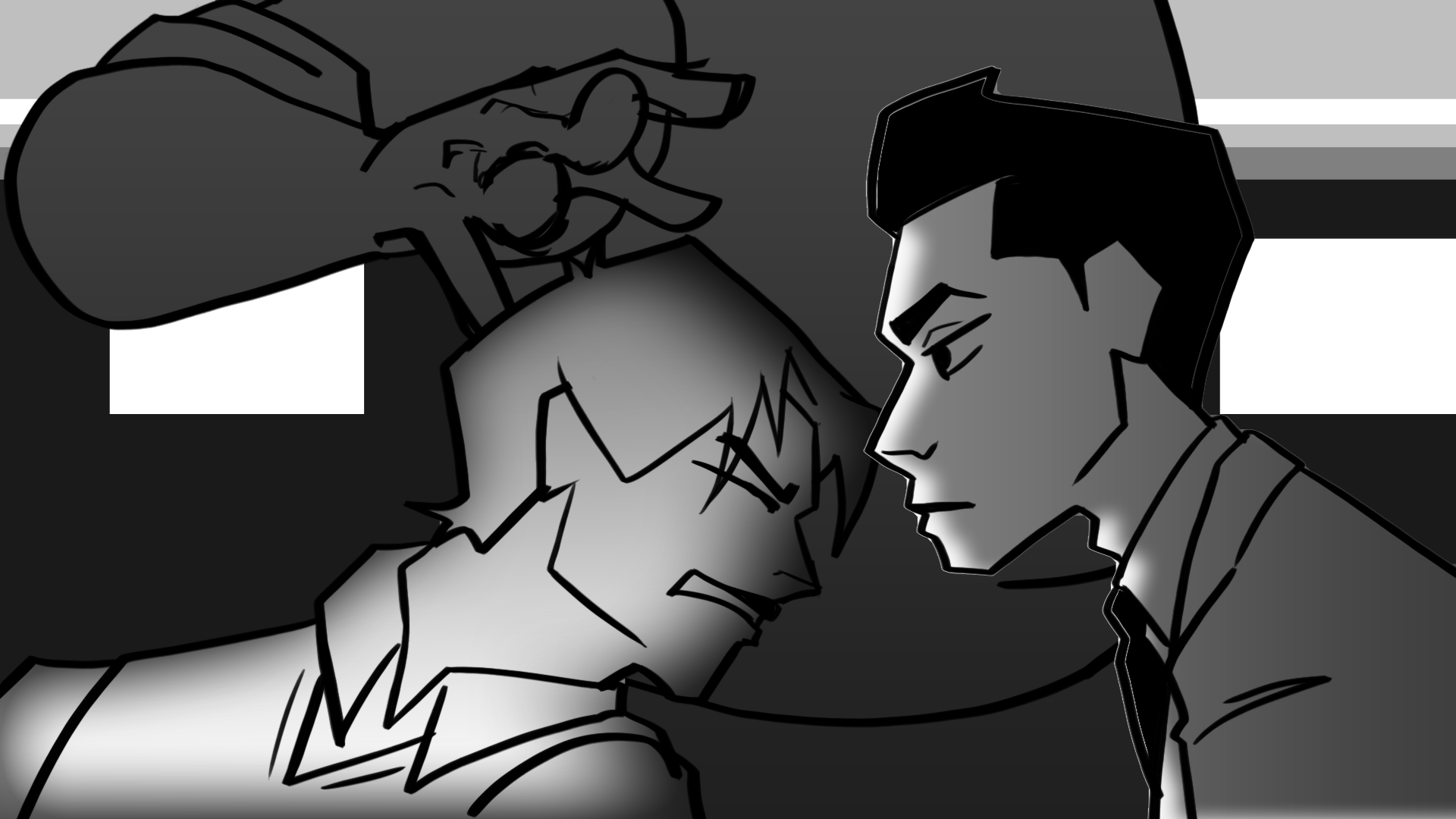
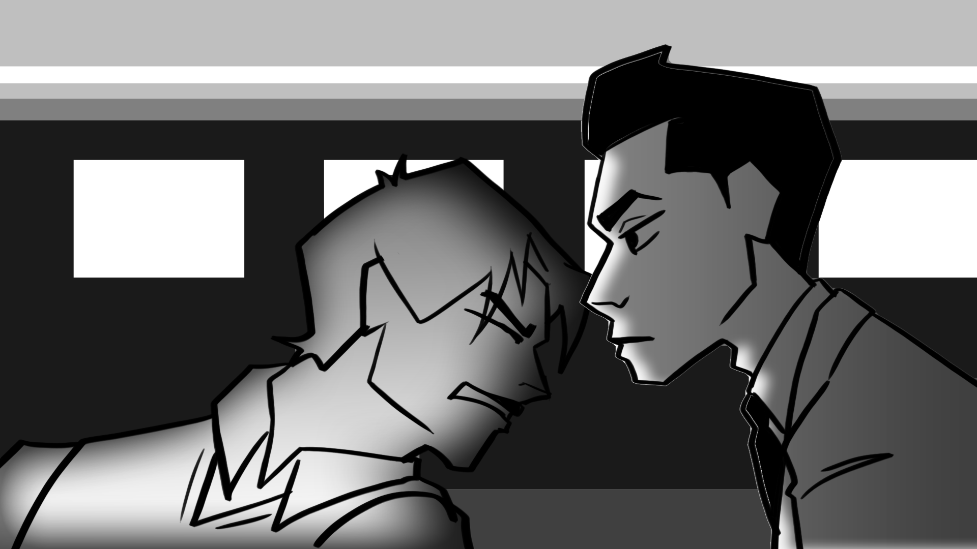
In a society stratified by social credit and powerful abilities, every year the annual Roulette designates a Pickpocket to participate in a bloodsport designed to bar access into the best high school in the nation. After a tragedy frames two girls from opposing social castes as fugitives, Mia and Indusa have to outwit Nexia as the unwavering police force pursues them.

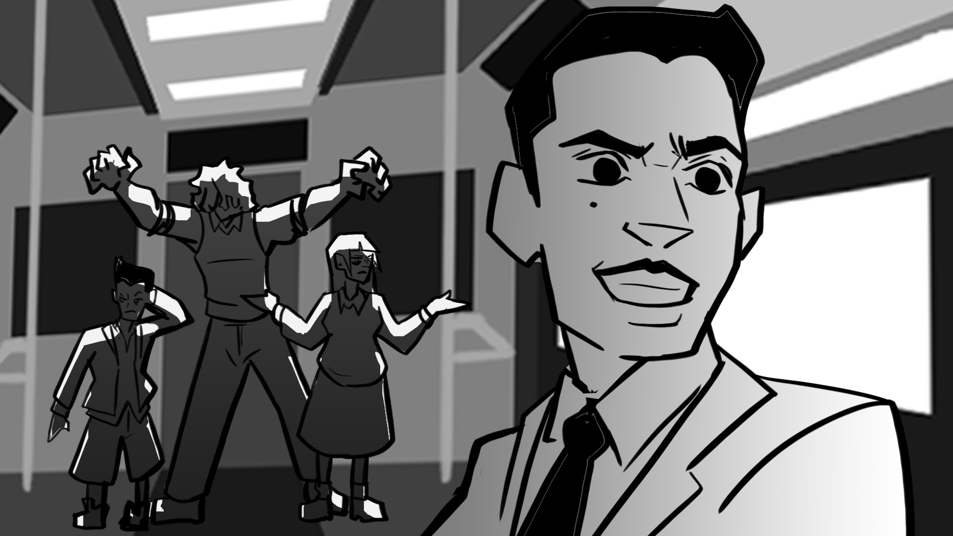
Train Station Entrance

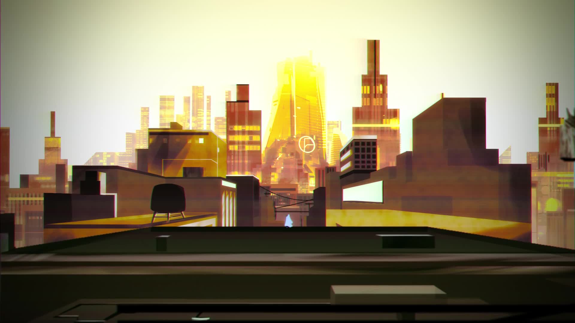
Los Sueños Concept

Undercity Concept

Train concept: Main cast

Los Sueños Concept: Mia

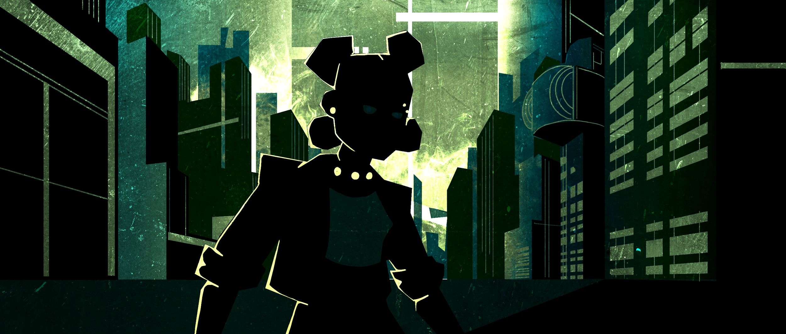
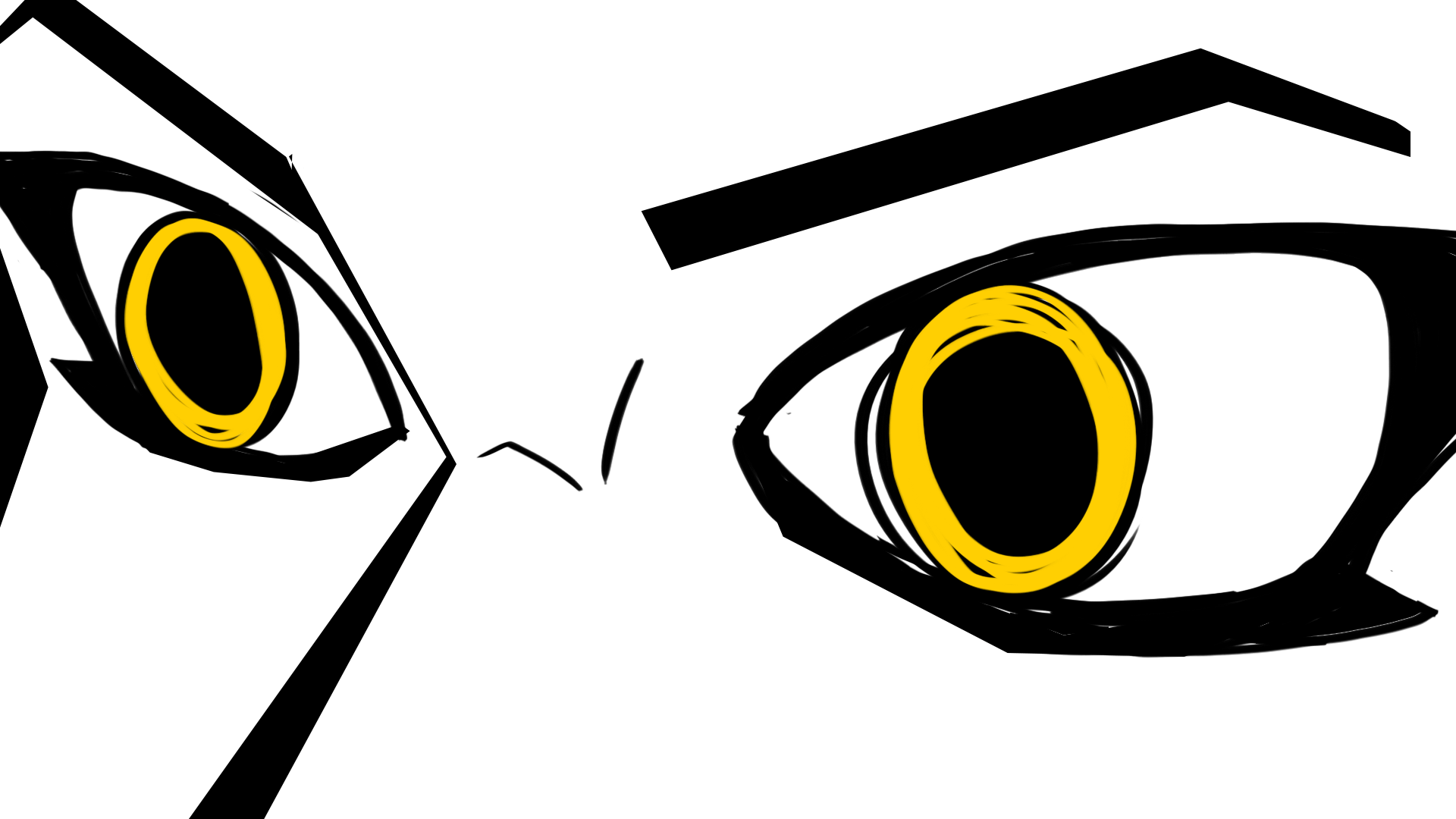
Nexia Concept

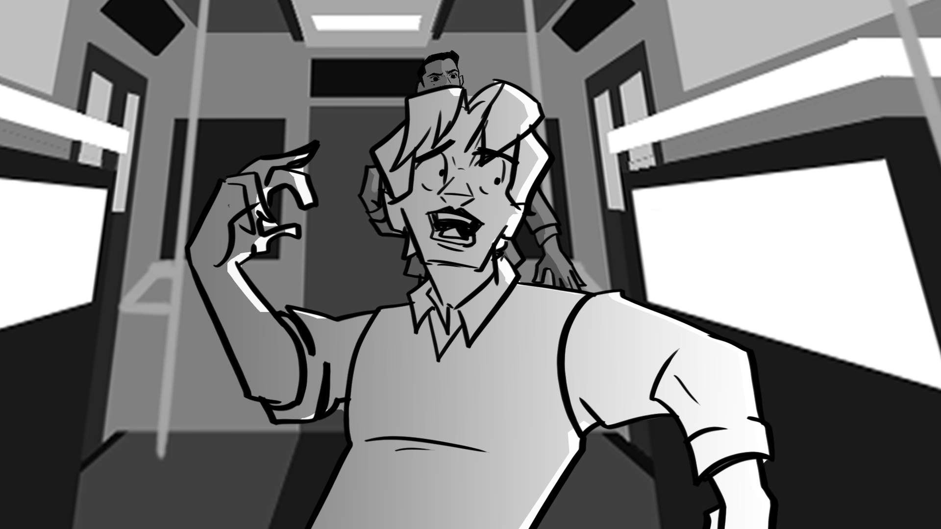
Train Concept: Interior

Los Sueños Concept2
Pickpocket Wide Banner

Pickpocket Poster 1

Pickpocket Poster 2
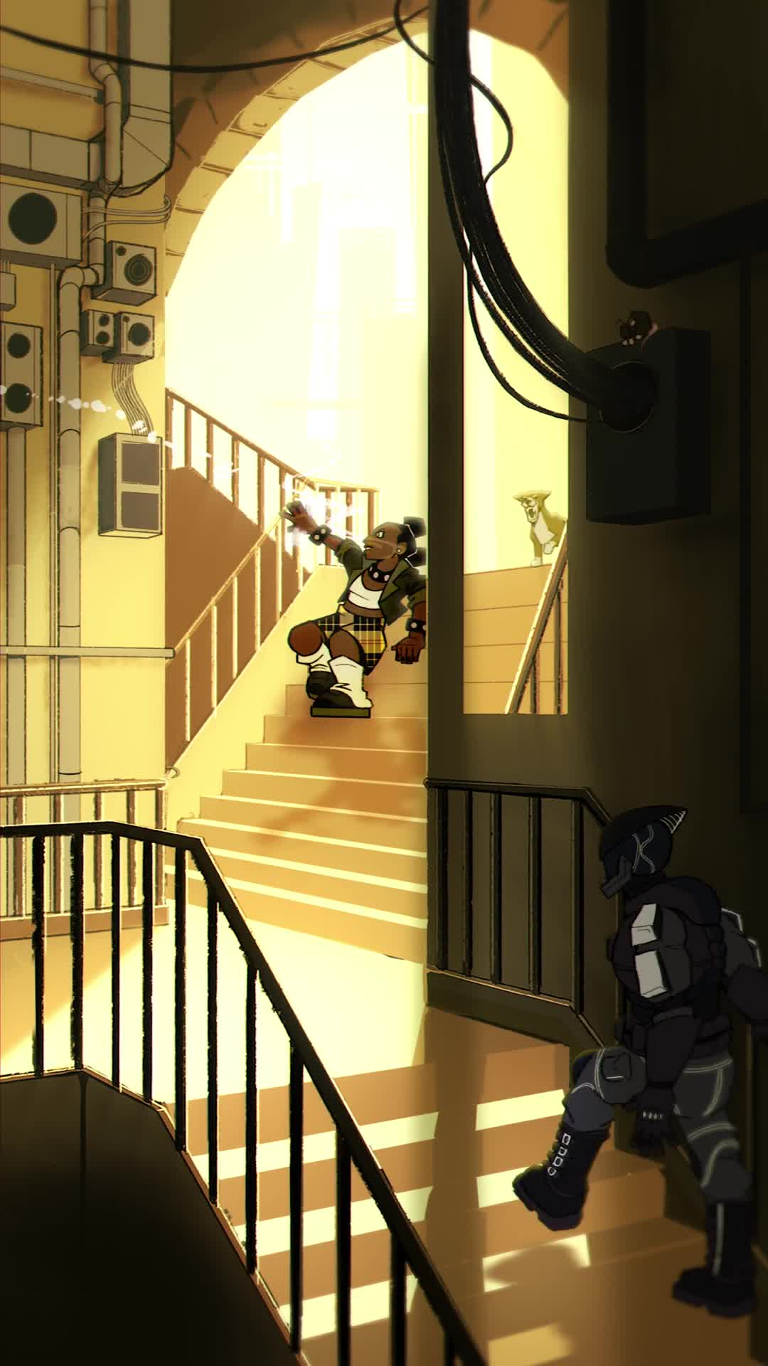
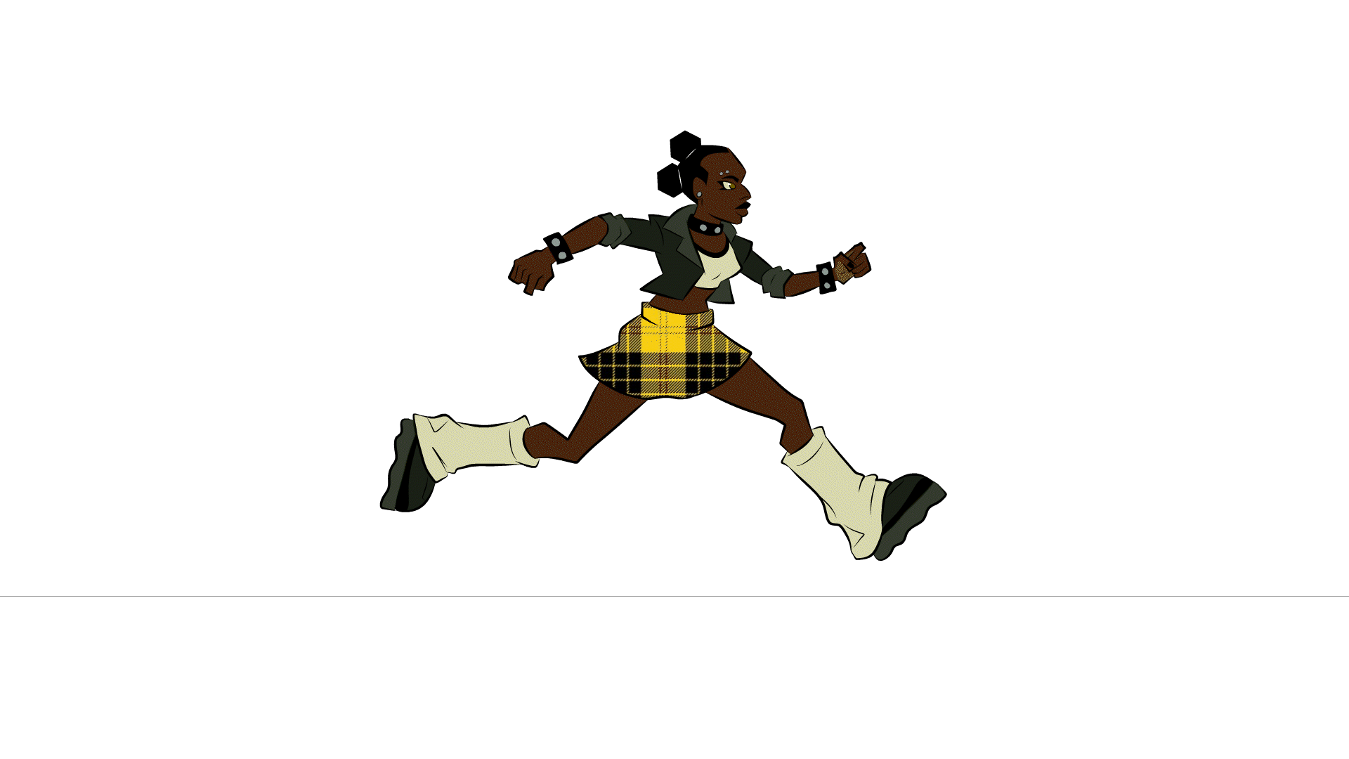
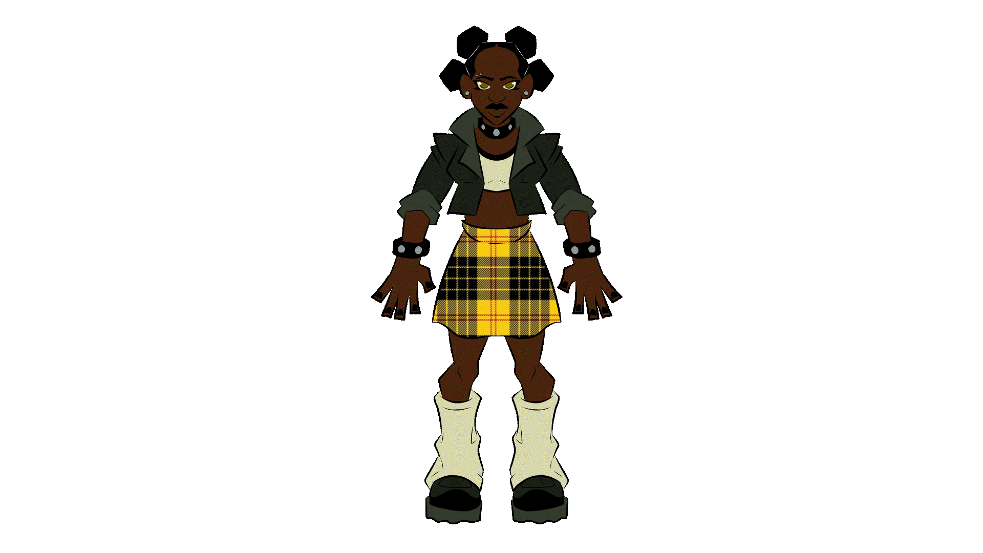
Mia Jones

A former Pickpocket who was successful and now goes to Legacy Academy free of cost. Born and raised in Los Suenos, Mia wants to use the opportunity given to her by winning the Roulette in order to game the system and help out her Mom. After helping the current Pickpocket, Indusa, brandishes her a fugitive, Mia finds agency within a found community and strives to dismantle the system instead of work within it.
Apathetic, cynical, rebellious, good natured

Design Process
Mia’s design was inspired a lot by Kat Elliot’s in Wendell & Wild, Rico Nasty, and “Aliyah Core” which is a modernized, feminine punk aesthetic. In the start of the series, she attends an elite private high school, so I wanted her attire to reflect a silent protest. She’d most likely get dress-coded, but this is a compromise her and the school settled on. Hair is really important as it’s heavily policed both in and out of the education system so I wanted to depict a hairstyle not typically seen in media. Bantu Knots are known as a protective hairstyle originating in the Zulu kingdom. The style is also a symbol of pro-Blackness, and leans into the rat motif with the “Mickey Mouse” ears. With this, I’ve been able to cheat the silhouette with the same technique.


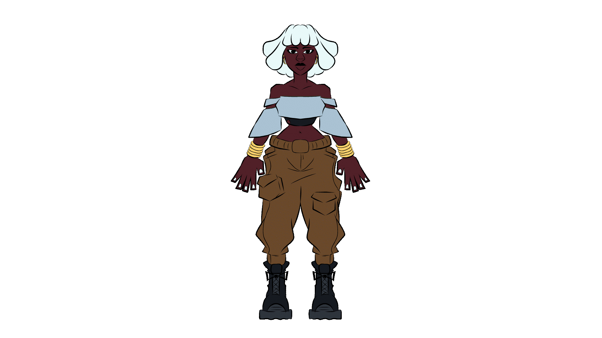
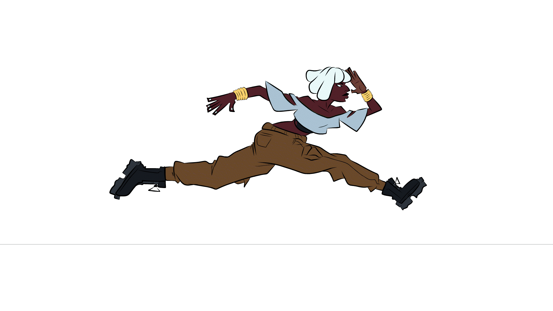
Indusa Sabri

A member of the Founding Families who was disowned after being marked. After being disowned Indusa is named the current Pickpocket and has to learn how to survive the ruthless city life. After learning more about the real Nexia, Indusa becomes radicalized and begins to use her family name to help those wronged by the system.
Optimistic, naive, stubborn, hard working


Design Process
Indusa is a flip of the typical “Magical Negro” archetype. Taking visual inspiration from animated characters who fall into this trope like Storm and Princess Kida from Atlantis: The Lost Empire, viewers might expect Indusa to have some sort of special ability to aid the protagonist, come from an enlightened society, and have much needed wisdom. Indusa is none of these things. She has no special abilities in a world full of them, her heritage is symbolic of the oppressive system not a critique of it, and she is completely out of her depth. This bait and switch is the core aspect of her character visually and in action as throughout the series, Indusa tries to reshape her identity to overpower other’s preconceived notions. Locs are another hairstyle heavily policed and Black people often have to fight against public assumptions in order to be taken seriously.
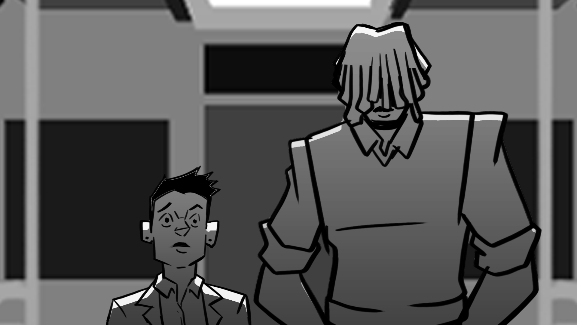
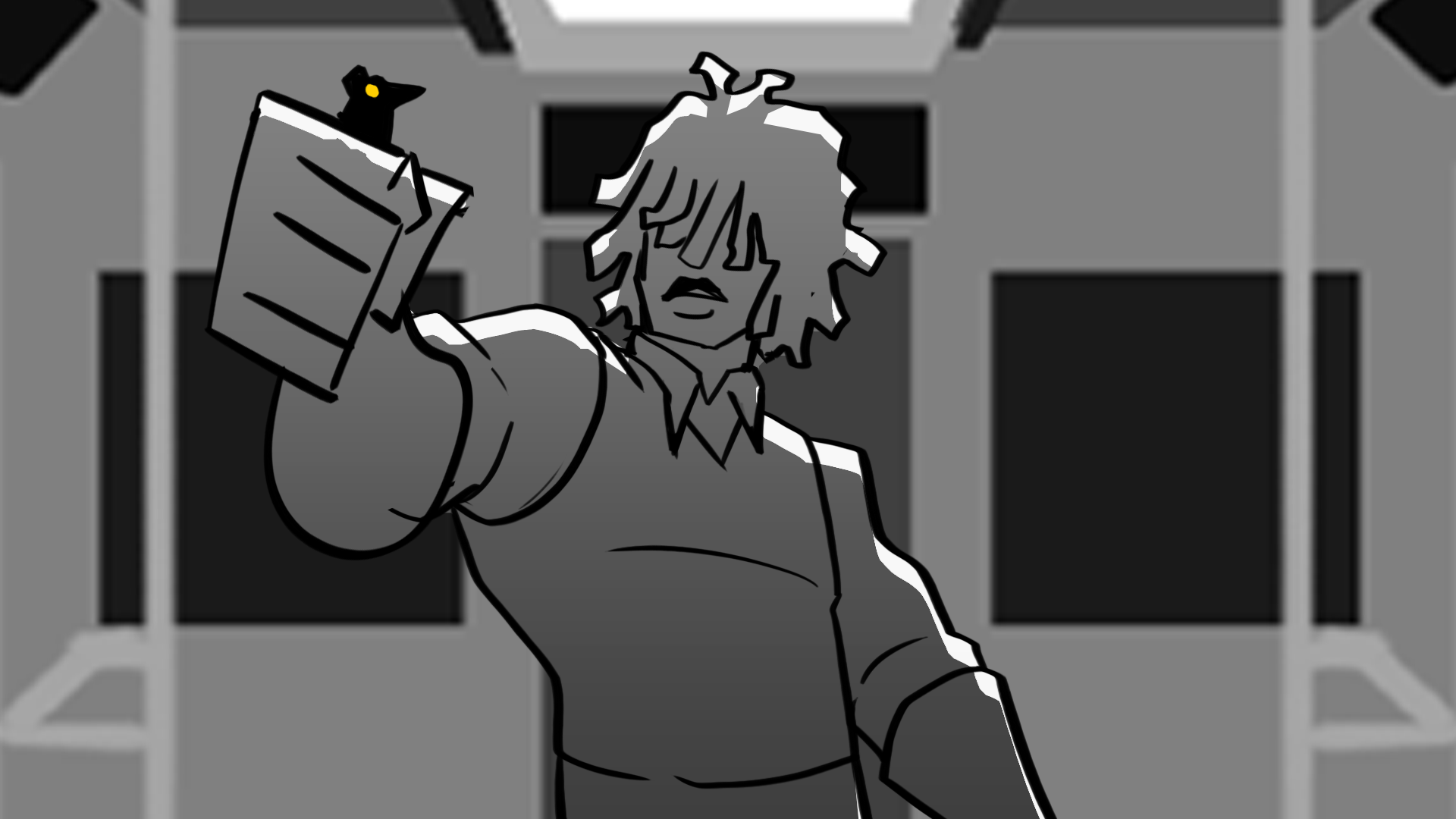
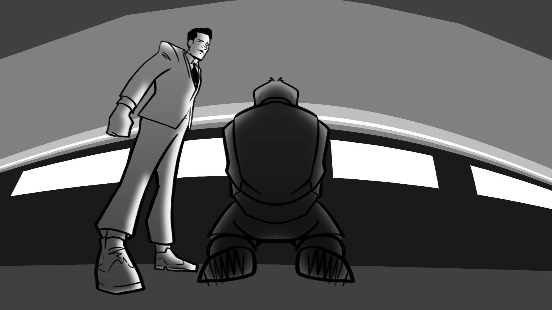
Carrion

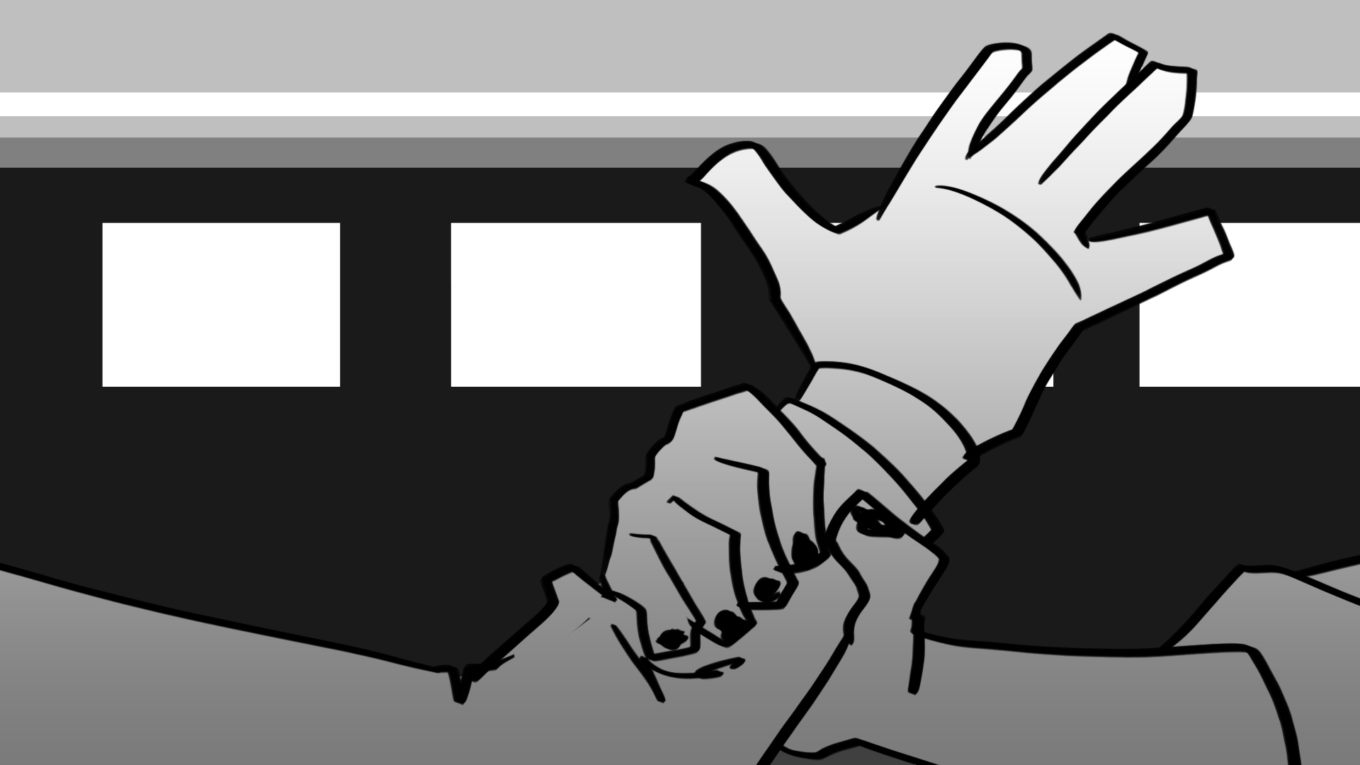
The leader of the Debt Collectors’ Special Division who is sent after the girls for the duration of the series. As the girls continue to evade capture, he becomes more and more ruthless until he eventually goes rogue and hunts the girls on his own terms. Everyone who is captured or killed by Carrion is scarred on half of their face.
Vengeful, perfectionist, sadistic, obsessive

Design Process
Carrion was the hardest character for me to design. I was inspired by characters who fell from grace into madness. Think Anakin Skywalker, Sasuke Uchiha, Lucifer as “The Fallen Angel”. Even though I wanted to avoid the redemption narrative offered by most of those examples, I wanted Carrion to be a symptom of a larger societal issue rather the illness itself. I started with the bird motif (to oppose Mia’s rat motif) but felt that my early designs were too disconnected from the world. I instead wanted to bring him closer to the techno-cop Debt Collectors he leads while keeping some of the more free-flowing aspects for differentiation.


logo
design
The design process for Pickpocket’s logo was challenging because I wanted to incorporate two opposing aesthetics to the design. Since Pickpocket is set in a dystopian future and the series has sci-fi elements, I needed to hint at that style within the title. Sci-fi typefaces are usually uniform, rigid, and segmented— evoking technology like alarm clocks, digital interfaces, or industrialized factories. On the other hand, Punk is at the core of these characters and the tone of the story. Punk typefaces are usually jagged, wild, and inconsistent— evoking the band logos and posters of the era.
In order to bring these two contrasting aesthetics together I decided to focus on the idea of distorting technology and using the Punk attitude to rupture the rigidity of technological typefaces.
This was an exercise in taking an idea to the extreme and then editing down to the essential idea.
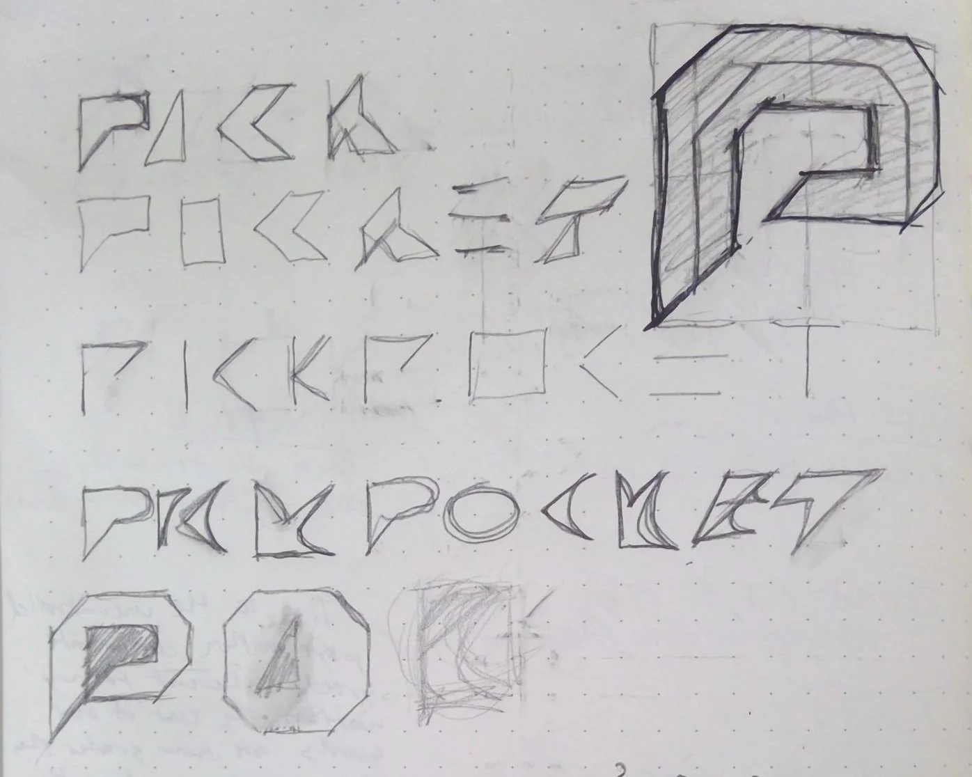
Logo Exploration
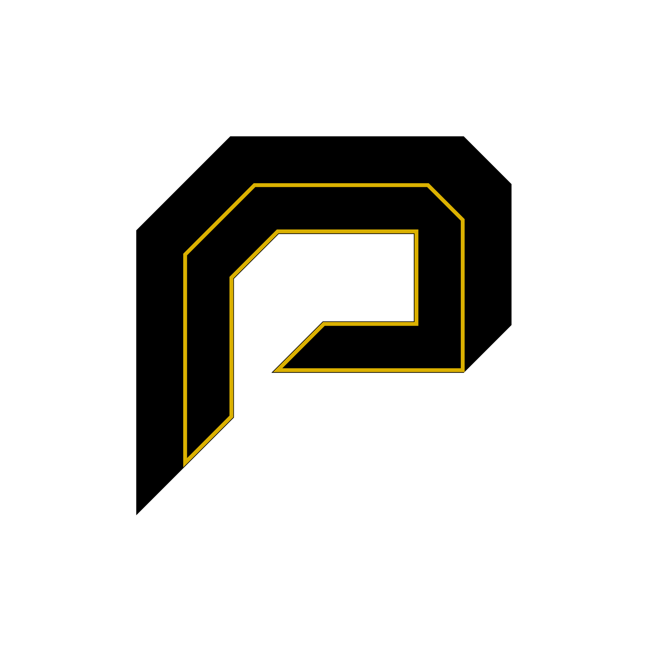
Monogram

Inverted Monogram

Logo Sketch

Version 1

Version 2

Version 3
Version 3 Inverted

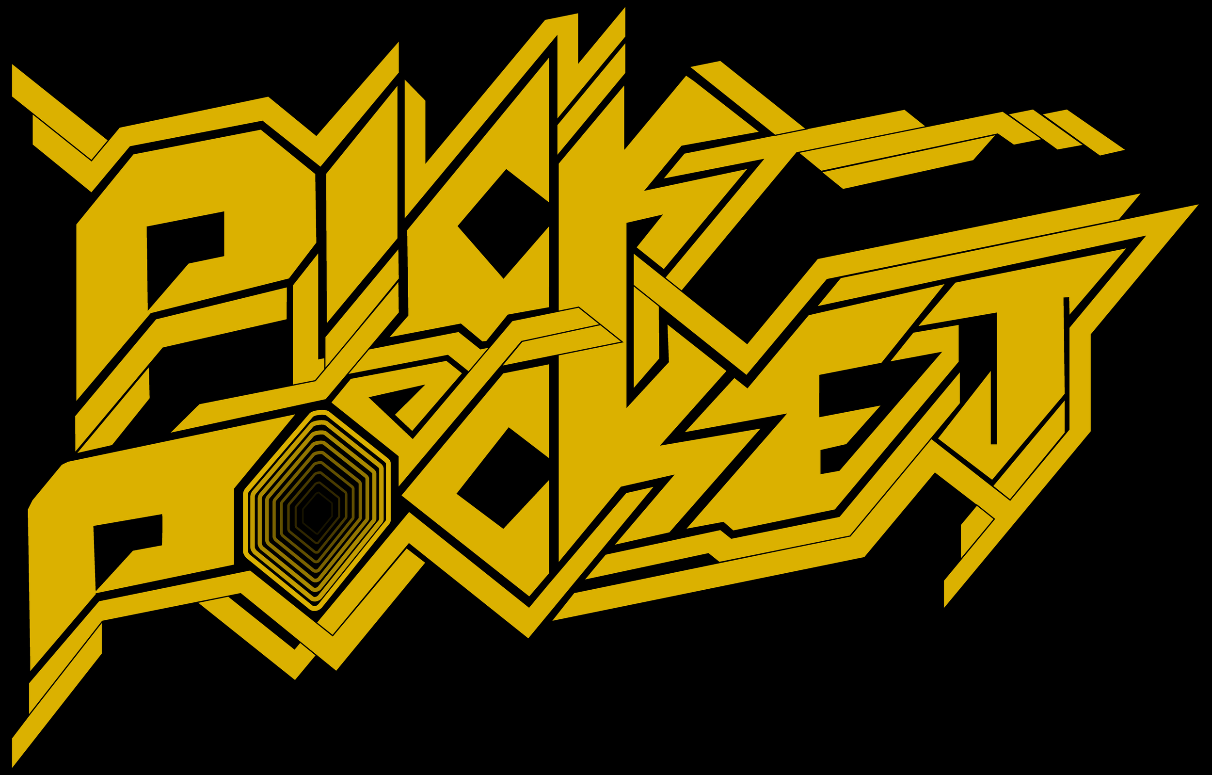
Final Logo

Final Logo Inverted


The Debt Collectors are the main faction chasing our heroes. Relentless in their pursuit, they always come to collect.
Pickpocket is a dystopian coming-of-age epic grounded in speculative fiction, social critique, and emotional truth. It is a story about two girls fleeing a broken world and stumbling into the possibility of a new one while learning in the process that liberation is not granted, it is built. Through its examination of identity, power, and resistance, the series offers a radical reimagining of how we might escape the systems that consume us.